
A CURE FOR THE CURIOUS
Fluent City is a modern-day culture school that teaches 10 languages, cocktail-making, interior design, and culture across 4 cities. We relaunched in September 2016. At the beginning of August, we found ourselves extremely behind on schedule; our site was set to relaunch in 3 weeks and our launch party was 10 days away. Our PR agency had fallen through on planning the party, so it was up to our internal team to create something out of nothing.
The problem? We were way over our tiny budget. Our PR agency had suggested doing a "zine" as a takeaway for press—which would have cost us over $1000 to print 80 of them. To reduce cost, we would have to print it black and white. But I was adamant about the fact that if we did that, it wouldn't convey our new brand accurately—which was crucial, since this would be the first time any press would be seeing our new brand and products. So in a meeting with the entire executive team present, I said, "Give me half the budget and I'll figure something out and create something better." It was 8 days before our launch party. Here's what happened next:

1/ 8 days. $400. What could we do with that?
Just to make things more fun, our budget got slashed even more! (#startuplife)
The first step was to consider our new brand personality and how we wanted to portray that with our press takeaway. Pictured left are the 4 main pillars of our new personality (taken from Style Guide).
Here's what I came up with first:
- Old school gumball machine. Each "gumball" would have something fun & punchy about the new brand printed on it. (This would have been COOL, but $$$)
- A custom designed box with individually wrapped gifts (Too $$$ and high maintenance)
- Coloring book with custom crayons in brand colors (also too $$$, childish and not enough production time)
2/ Final First Thoughts
It was time to scrap some of those bigger ideas and consider our resources. What was something that would convey our core values, show off our new brand personality, AND be cost-effective?
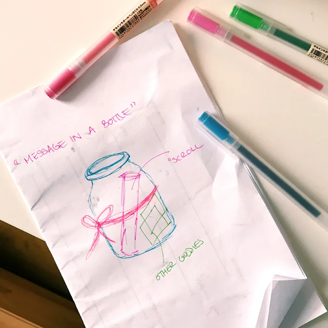
That's when I came up with this "message in a bottle" idea. A message in a bottle is surprising, delightful, and unexpected. To make it more current, I thought of using mason jars.
This jar would contain everything that press needed to know about our new brand. You can see my initial drawing on the right.
Ultimately, the bow was scrapped and we decided on using a unique nutrition label as decoration for the jar (this idea came when I was grocery shopping!).
3/ Designs!
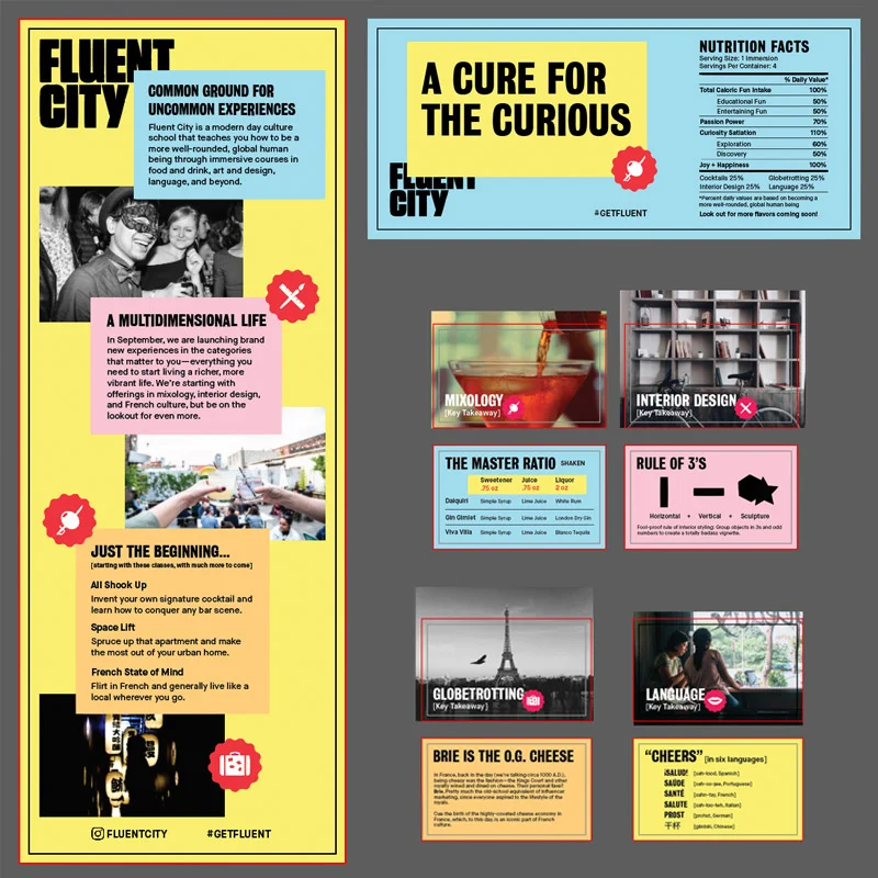
In addition to the nutrition label, there were 2 other main elements that I designed:
- 1/ A "scroll" explaining our relaunch and new products to press
- 2/ 4 takeaway cards with what people would learn at our party (since we are an educational company)
You can see the final designs for each element here:
4/ My "Prototype"!
The next step was to print a copy of all designs and put them all together—to make sure everything would fit and to be sure this jar represented everything that we needed it to.
Here's how it fulfilled our 4 brand personality traits:
- Passionate: It's colorful, interesting, and out of the box.
- Hospitable: Inside, it would have the 4 things that guests would learn over the course of their evening—a "gift" of knowledge.
- Unconventional: The final design used a nutrition label with information that was related to our brand.
- Real: It is way more three-dimensional than a magazine. It's also something that can be repurposed and used for something else.


5/ Finding Materials & Production
This was rather tricky, as we had to stay within budget. My initial thought was to buy a massive pack of mason jars from an art store; I knew they weren't too expensive. But that's when I found a local jar supplier in Brooklyn—and they had these fun jars with the black top, which were much more unique than the typical silver ones.
For the stickers, we printed them via StickerMule—we needed something simple, easy, and quick.
For production, we had a quick assembly line process; I luckily had the help of 2 other team members. One person for sticking labels onto the jars, one person for rolling up the scroll, and one person for sorting the takeaway cards.
6/ The Final Product
You can see the final product pictured to the right. In each jar, there was the following:
- 1 brand-related "nutrition label" that included our hashtag and info about our new products
- 1 "scroll" that explained our new brand and products
- 4 branded Fluent City stickers
- 2 branded Fluent City pins
80 of these jars were created—all within our budget of $400. The best part? We received rave reviews from all guests at the party that received one of these. We had found an unexpected way to connect with our new audience.


